
Let’s talk Gallery Walls. It’s a topic I get asked about, often. A quick Pinterest search will give you lots of options on how to arrange frames. However, the key to creating an aesthetically pleasing gallery wall is to consider the whole wall.
Look beyond the frames.
Are there doorways, built-ins, awkward angles or furniture on or against the wall? All of these elements need to be taken into consideration when creating a gallery wall.
Start by positioning the furniture where you think it makes most sense for your space (I will elaborate on furniture layout in a future post); then use the empty wall space around it to visualize a general layout. This space might not be a perfect square or rectangle, but that’s okay!
Once you have figured out a layout, the next step is to decide on what type of frames make the most sense. If you are trying to mix and match frames, do so with purpose — be sure to balance out frame thickness with the visual weight of the furniture and/or built-ins.
Typically, if I’m not doing a standard grid layout where all the frames need to be identical, I like to vary the frame colors to include light, medium and dark shades. It creates interest, adds depth, helps balance out visual weight, and it gives you the most flexibility — similar to how you would control light in a room.
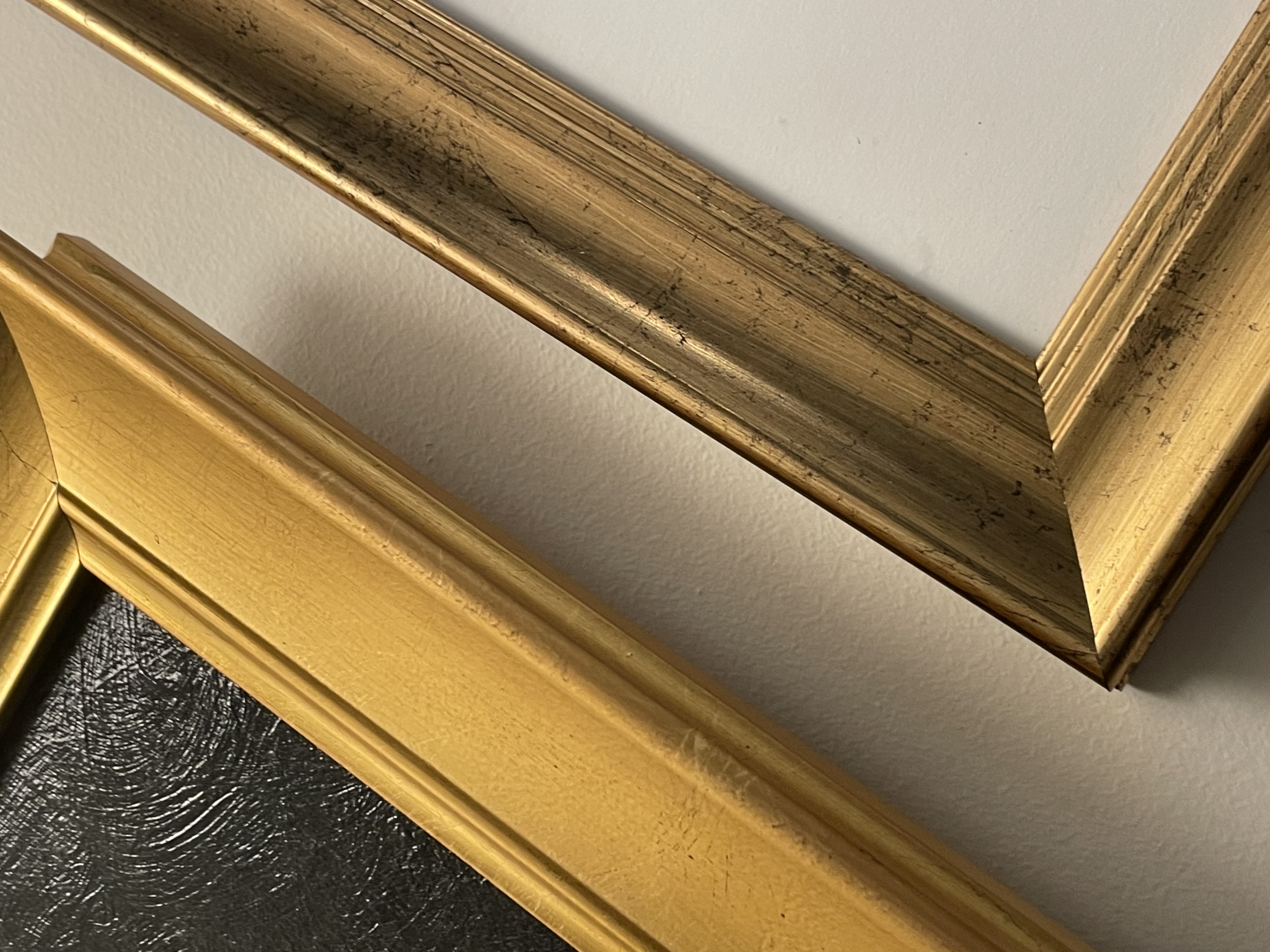
The other option is to create contrast by using two completely different colors. This approach works well when working with gilded frames.
Depending on which option you choose, you can achieve both casual and formal styles. I’ll share some examples from my own home, below.
When deciding on content for frames, the function of the space matters. I love seeing family photos on stairways and dining areas, especially ones depicting multiple generations. Hallways are great for travel photos — perhaps highlighting that special trip you took. Family rooms are perfect for telling your story — who you are, your family, your interests, etc.
Also, if you prefer to tread lightly when it comes to ‘going bold’ in your space, gallery walls are a great way to add color to an otherwise neutral space. You can also take this one step further, and work the colors from your photographs into the room, thru accent pieces.
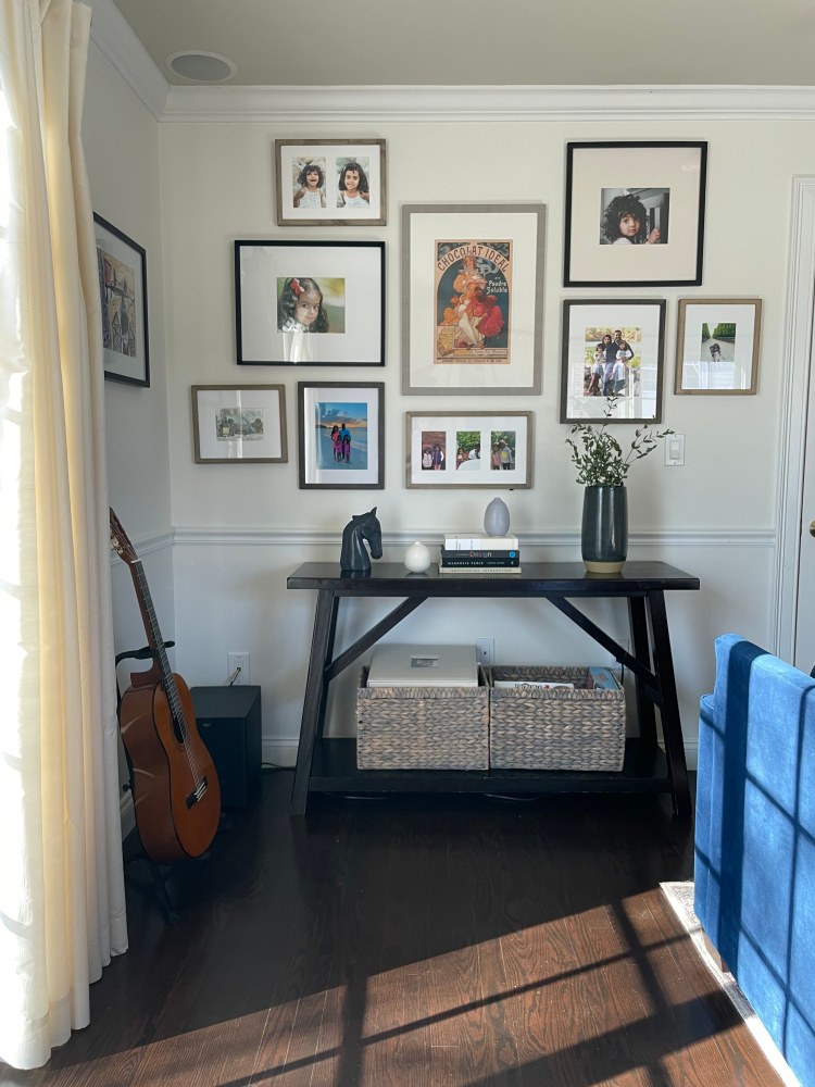
I opted for full color photographs and art prints in our more casual family room. This gallery wall displays photos of our family, mixed with art prints and posters. The orangey-reds and deep blues in the frames tie back to the guitar and couch.
Mixing in some light and medium frames, help balance out the dark floors and console table. If I had chosen to use dark frames, all in one color — the wall would feel weighed down.
Mixing photographs w/ art prints, posters etc. can seem expensive, but many sites like Juniper Print Shop, Heritage Art Prints, Heirloom Print Shop, and Artfully Walls offer both high quality prints and/or digital downloads, at reasonable prices.
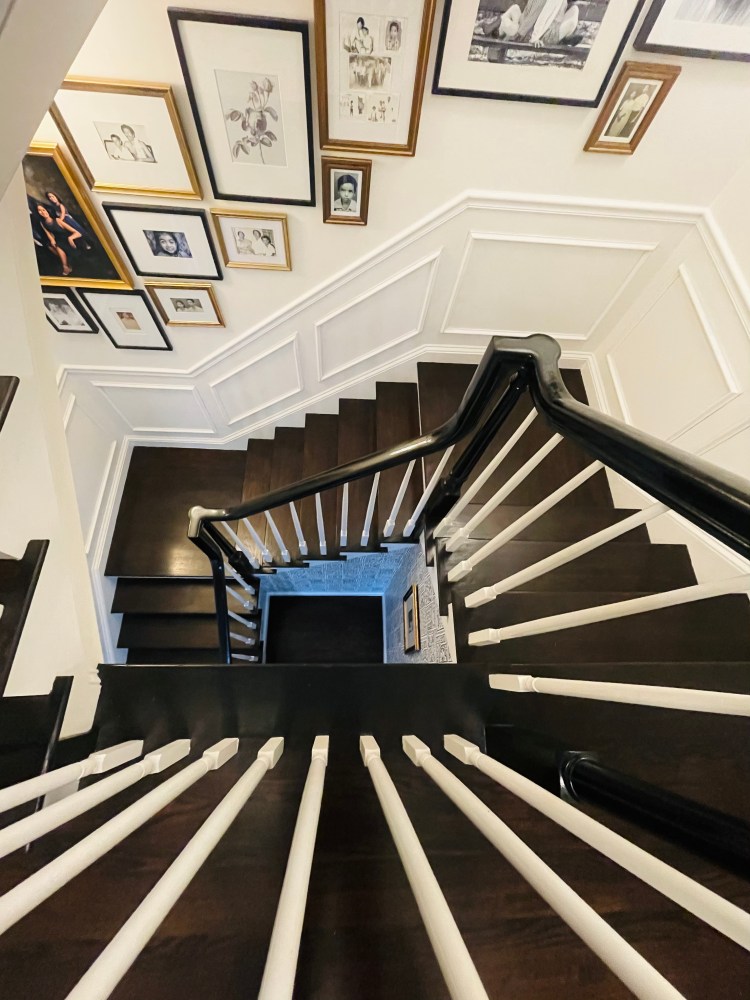
On our stairs, I followed the natural angle of the architecture, but kept the frame layout organic. We had a painting commissioned several years back of our family. It came in a large gilded frame and didn’t match our decor, at the time. We also had a collection of black/white vintage photographs that had been collecting dust in our attic for years, so I decided to make them the subject matter of this gallery wall.
To keep things fresh and find a connection between two completely different types of visuals (a painting and vintage photos), I decided to integrate them with more recent black/white photos and art prints in a combination of gilded and black frames. The gilded frames highlight the monochromatic moments in time, but the addition of the sleek black frames keeps the gallery wall contemporary.
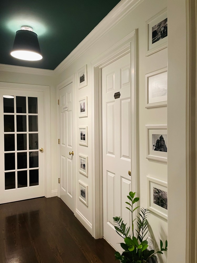
Our hallway has multiple doors and very narrow wall spaces. I repurposed simple off-white Ikea frames that I’ve had for years, with black/white photos of Paris (from a pre Covid trip) to create a symmetrical grid approach. Because this space was tight, the goal was to create a gallery wall that felt more like millwork than a collection of frames. I kept the photos black/white to tie this space back to the monochromatic photos on the stairs.
Being more subtle with frames is a good solution for small spaces that want to feel bigger. I painted the ceiling a dark green, to create height and draw attention away from the narrow walls. Finally I added a potted plant to tie the green ceiling into the space.
Regardless of the frames you choose or the layout you use, gallery walls should never feel forced. They should feel natural and proportional to the wall space — making them feel as though they were always there.
