
Having worked in the design industry – creating exhibits for almost two decades now, I can walk into any space and immediately notice when something just isn’t right. How a color looks outdoors, indoors, in daylight vs. at night, along with how it looks next to other colors needs to be considered when making paint selections. Even though the choices seem endless – not all colors work the same way.
When selecting colors for your home, my recommendation would be to select a few that you like; your home is an extension of who you are, so don’t feel limited by ‘safe’ options. If you are feeling ambitious, get samples and paint them in sections on your wall; you can also just tape up the color swatches using painters tape.
Then, imagine setting up a time lapse camera at various locations within your home, and watch the light shift thru the space over the course of the day – over several days; be sure to capture a sunny day and an overcast one. Observe which direction the light comes in, where it casts reflections and shadows, and so on and so forth. If a space gets enough light throughout the day, you have an opportunity to go bold with your color choices. As beautiful as moody spaces are, light is the key to making them glow.

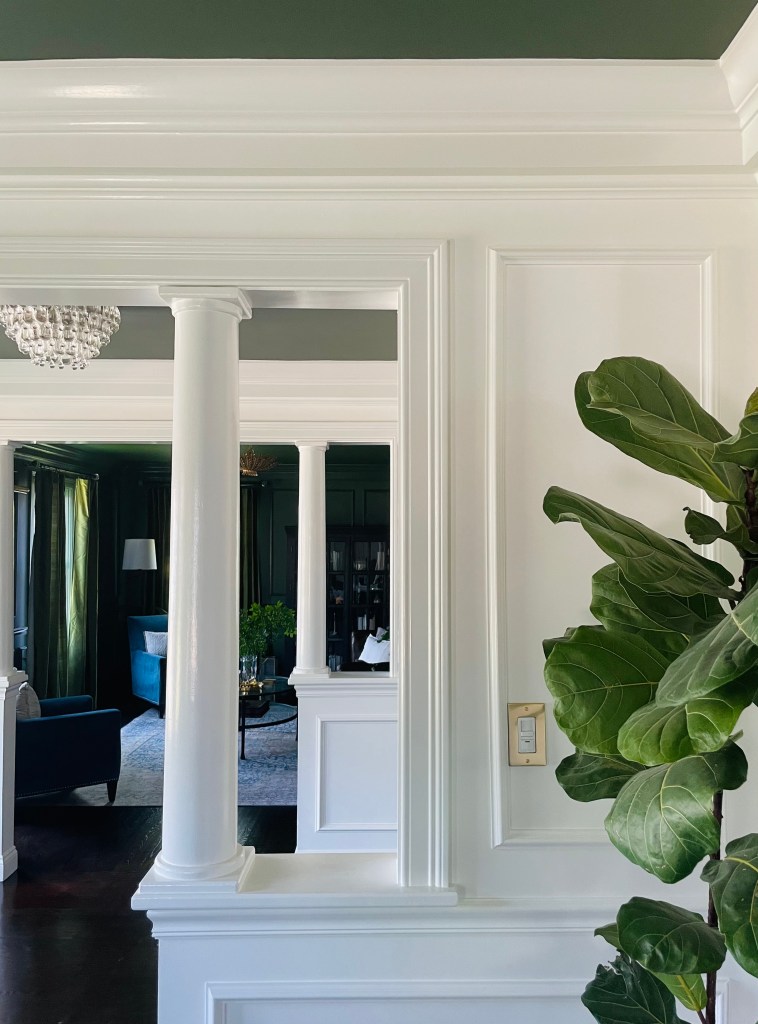
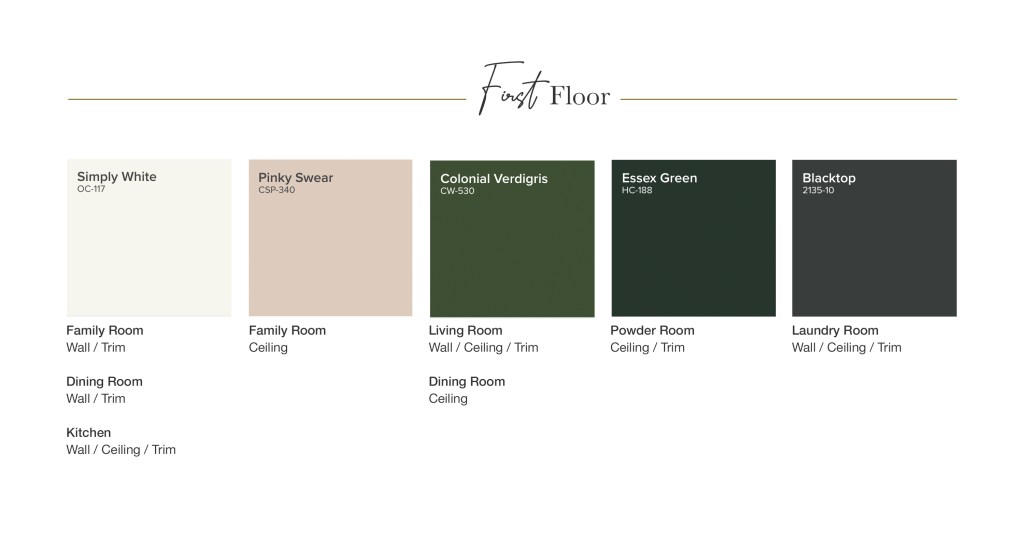
White spaces are beautiful – they are clean and versatile, but unexpected combinations are even more beautiful. Colors are rated based on Light Reflectance Values. The higher the rating, the higher the percentage of light it reflects. In our home, I opted for colors that have both high and low LRVs. I found the contrast to be more intriguing than the paint colors themselves.
After I put the palette together, I realized that these have been my favorite colors since I was probably 6 or 7 years old. Around that time, I remember asking my mom to make a macramé style wall hanging using pink and green yarn. Pink at the time was my favorite and green complemented it so nicely. Although I’ve refined my approach to color selection a bit since then, some things never change. When it comes to design, you can’t go wrong when you start with the things you love.
The flow of traffic within a home also plays a significant role in determining what color goes where. When you walk in the front door, which way do you go? In our home, as soon as we enter, we either go straight and up the stairs, or bee line right – thru the dining room and into the kitchen. The living room has gone unnoticed for as long as we’ve lived here. As a result, I wanted to give this space it’s due.
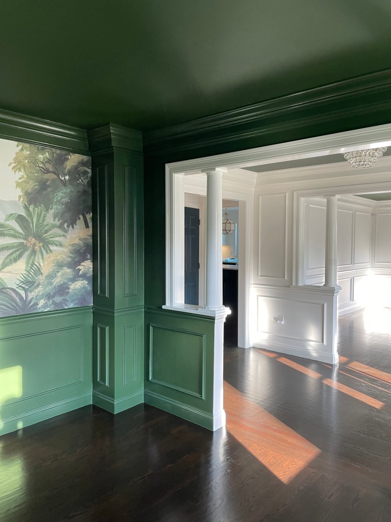
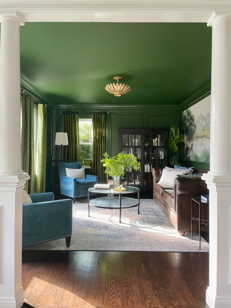
The purpose of the room, also affects color selection. I chose floor to ceiling green in our living room (much to the dismay of my very patient painter). Even though an open floor plan proved to be challenging, I wanted this room to feel dramatic and inviting. It needed to be eye-catching enough to draw attention.
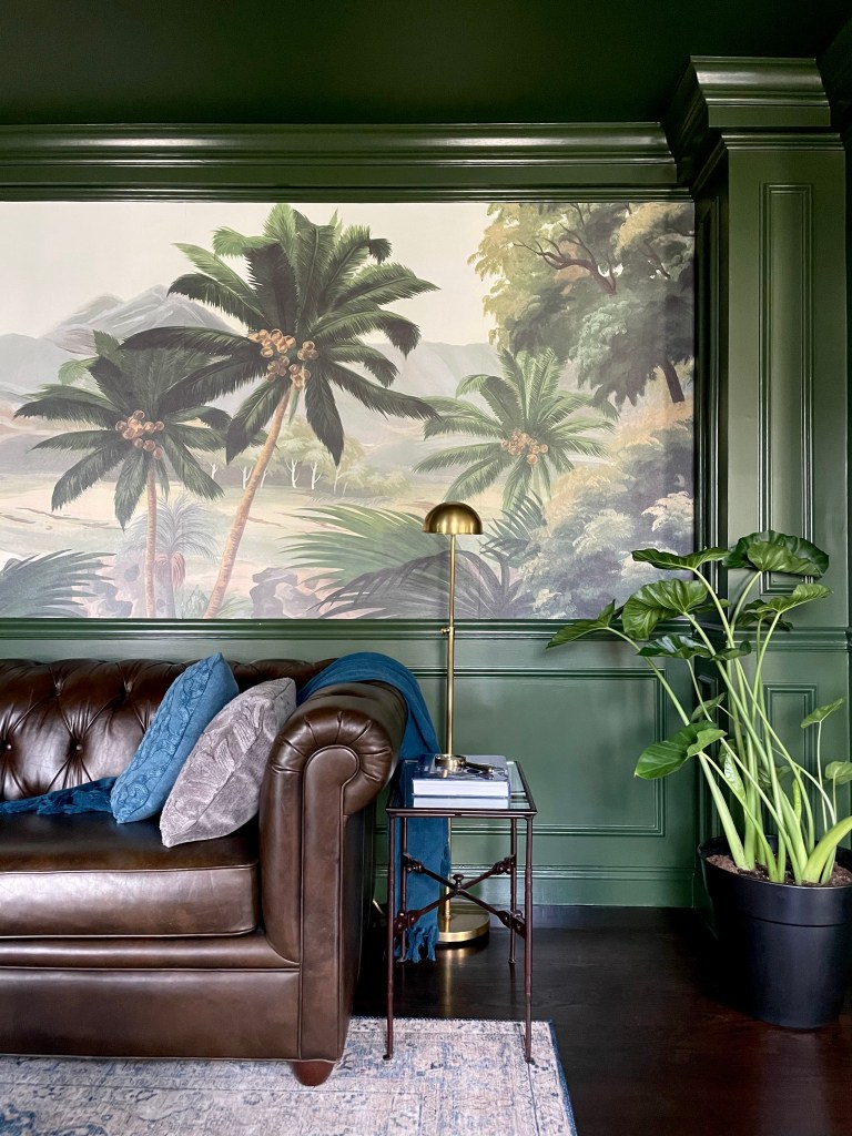
During the day as the light streams in, the room transports you to a place far away. Whereas at night, you find yourself floating thru conversations while enjoying an Old Fashioned. I was inspired by my Kerala (India) roots mixed with a nod to British Colonial style. I added native plants and molding detail to frame the existing wall mural and make the space come to life.
If you have an open floor plan, it’s natural to feel like every space needs to be cohesive, but color is a great way to differentiate between spaces – you don’t have to be limited by a single color or stay within similar shades. Be driven by the purpose of each room, over creating uniformity.
Our house has taken years to design – mostly because I’ve wanted to find the story in each space, and I’ve learned that writing them doesn’t happen overnight. Finding your story is the first step to create a space as unique and beautiful as you.
Rooms are like chapters in a book, bound together into a Home.
